Design
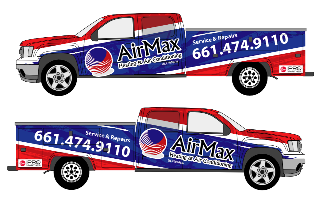
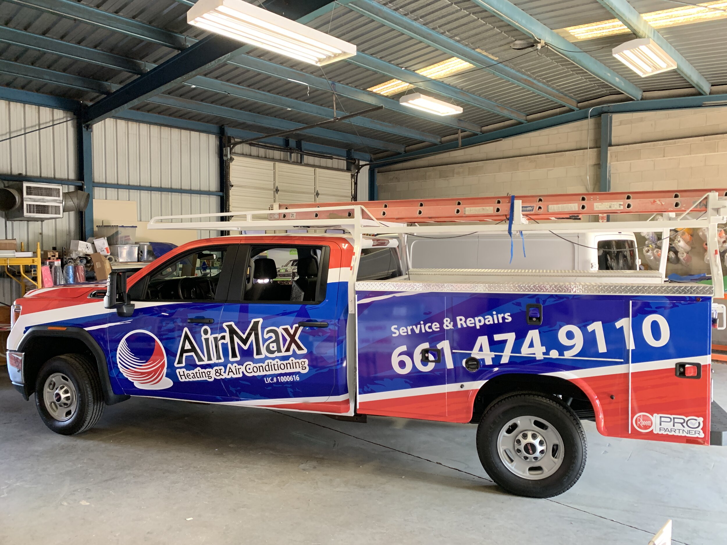
We Design Vehicle Wraps that are effective with our 15+ years experienced Graphic Designer. We design alongside the installer for the best results. Our goal is to make your company stand out and be noticed.
Best wraps are limited to Brand, Tagline, Web and/or Phone with (no photos) just solid colors for the SIDES. Viewer only has 2.5 seconds to view the message. On the REAR limited to Brand, Tagline, Web and/or Phone and 3 bullet max.
The Design Process is the longest part of the vehicle wrap process, it can take anywhere from 5 to 40 hours, depending on the complexity of the design and style of vehicle.
Every Design is tailored to fit the client needs.
5 simple rules for more effective vehicle wraps
Rule #1: Start with a great brand
One reason why so many wraps fail from a marketing perspective is due to the fact that the business has a poor brand identity and logo.
Rule #2: Don’t use photos
Photos are usually a crutch for a poor brand. The photo is not a brand identity: it doesn’t connect me with the business name. Maybe it connects me with what they do, but that’s really the point of a good brand.
Take the example of the HVAC company with a big picture of an air conditioner. Great, now I know you do air conditioning. But who are you? I don’t know, because I only had 2.5 seconds to view the message.
Rule #3: Limit your copy
There are only three or four things a good wrap needs: a strong brand implementation and perhaps tagline messaging, a web address and maybe a phone number. Bullet lists that are more like shopping lists have no place on a vehicle. This isn’t the Yellow Pages. Would you rather list 10 things and have none remembered or even be able to be read, or maybe one or two that might be remembered?
If you prioritize your copy, it will be more effective. In general, the hierarchy should always be: Brand, Tagline, Web and/or Phone.
Rule #4: Design to stand out, not fit in
This isn’t the part where many might say diamond plate, carbon fiber, tribal flames will make that truck wrap stand out. Quite the contrary. By eliminating all those frills, noisy backgrounds, photos, bevels and glows, you’ll be on your way to designing a wrap that really stands out.
The wrap market is so littered with visual noise, that when you see something that’s impactful, which you can read and is actually memorable, it can’t help but stand out among the visual clutter that viewers are now so accustomed to seeing.
Rule #5: Simple and obvious is good
If the viewer needs to work too hard to figure out the primary brand messaging, it’s an opportunity lost. The medium isn’t the same as print design, where the viewer can stop, absorb the advertising and try to understand the message. Consider that one primary take-away you’re hoping to leave with the viewer. What is it? Does the wrap effectively communicate it? Is it lost in the imagery?
When supplying your own artwork, make sure it's high-resolution- at least 300 DPI (dots per inch) and sent in a file format like (.jpeg .tiff .pdf .eps .ai) Remember that the graphics will be enlarged to fit your vehicle so low quality files will look pixilated. Never send logos or images taken from your website or a business card- they offer poor resolution and quality. Remaking logos and acquiring high resolution images will result higher costs for the design.


